15 Jun 2025
At the beginning of Q2 this year, I decided to pursue formal studies in data science. An online, self-paced course wasn’t motivating enough. I wanted something that has monitored learning and deadlines, with a deeper take of the the subject matter and having guardrails to spur me to finish. I looked around and found the PGDip in Industrial Engineering: Data Science at Stellenbosch University. It has a great delivery mode for working professionals and covers all the essential topics of data science according to the Curriculum.
Why Data Science Now?
Getting to a spatial analysis requires a great deal of data management and cleaning, I have had my share of that through my career. So, as part of my upskilling strategy I have been thinking about and working on :
strengthening my data analysis skills to become a Spatial Data Scientist, aiming to seat myself at the intersection of spatial data analysis and data science.
I self evaluated to check on some personal traits justifying why steer in that direction
-
I love combing through data and I appreciate a good data wrangle. Blogged a series sometime ago.
-
Pushed the boundaries of excel with 1 Million records - If that counts as Big Data.
-
While working with data, my aim has been to get to the spatial component and get cartographic output, giving other data elements scant attention. Now is the time to change that and prod the data more.
-
I have worked with many and large datasets before but, my approach has been largely, brute force, labour intensive and rudimentary. Through data science studies, I can leverage programmatic approaches to data wrangling.
Taking Havard’s CS50
One of the requirements of the PostGrad Diploma is studies in Computer programming. They also recommend, among other courses, taking Harvard’s CS50 to meet this requirement. I choose to take this route even though I have done CT130- Computer Science for Engineers. That was 25 years ago and the focus Language was Pascal. For my undergrad research project I delved in Visual Basic. Over the years though I also have dubbled in C, recently R. Some JavaScript and HTML in a Web Mapping Project. So computer code, I can understand fairly well and I can think programmatically to an extent.
Taking CS50, I aim to:
- Relearn Computer Science concept, bringing structure to the knowledge and skill I have acquired over time as a spatial scientist.
- Get a good grasp of Computer Science Concepts like, picking from memory, pointers in C.
- Have a fresh and solid base for when starting the PGDip studies
Documenting The Journey
I enjoy writing, so I will start a blog series designed to document my experience with Harvard’s CS50. In addition to completing the course and getting a certificate, this chronicle should hopefully also act as evidence/ motivation for use when applying for admission to the PGDip.
With the help of ChatGPT, I settled for a 12 week schedule to complete CS50, giving enough time to the application deadline. October 2025. Tomorrow I start!
07 Jun 2025
On the ‘5-9’ job I use ESRI software extensively. Over the course of my career I have invested time learning the ins and outs of the software from data capturing , editing to analysis. I set apart regular time to learn how to use the software. Efficiency and increase in productivity also depends on saving on the micro-seconds one spends doing things the inefficient way. So I poured through the HandsOn section of earlier editions of ArcUser’s, gaining much skill, self-training.
Fast forward to date, the organisation is making a switch from ArcMap to ArcGIS Pro because of ArcMap reaching end of life support. Pro has been around for some time now already and understandably, for large organisations making the switch has huge implications on production hence the somewhat ‘slow’ adoption of new technologies - Don’t quickly break what is working at the expense of service delivery. Now though, was the time to migrate.
I knew some advantages of Pro, but the internal resistance was stemming from the comfortable skill level in older software and from the change in software design philosophy from ArcMap to Pro.
Draw me a picture
The past week I spend doing a course, ArcGIS Pro Standard to improve my software skill level. This was not the first time opening the Pro software though. I have had a few months dabbling in the software especially with data management. So I could easily follow the Course Instructor’s lead. In my head though I struggled with how things worked in Pro vs ArcMap. Somewhere three quarters through the course material, everything clicked in place as I understood things my own way. I came up with a hand sketch and from there-on it was smooth sailing…
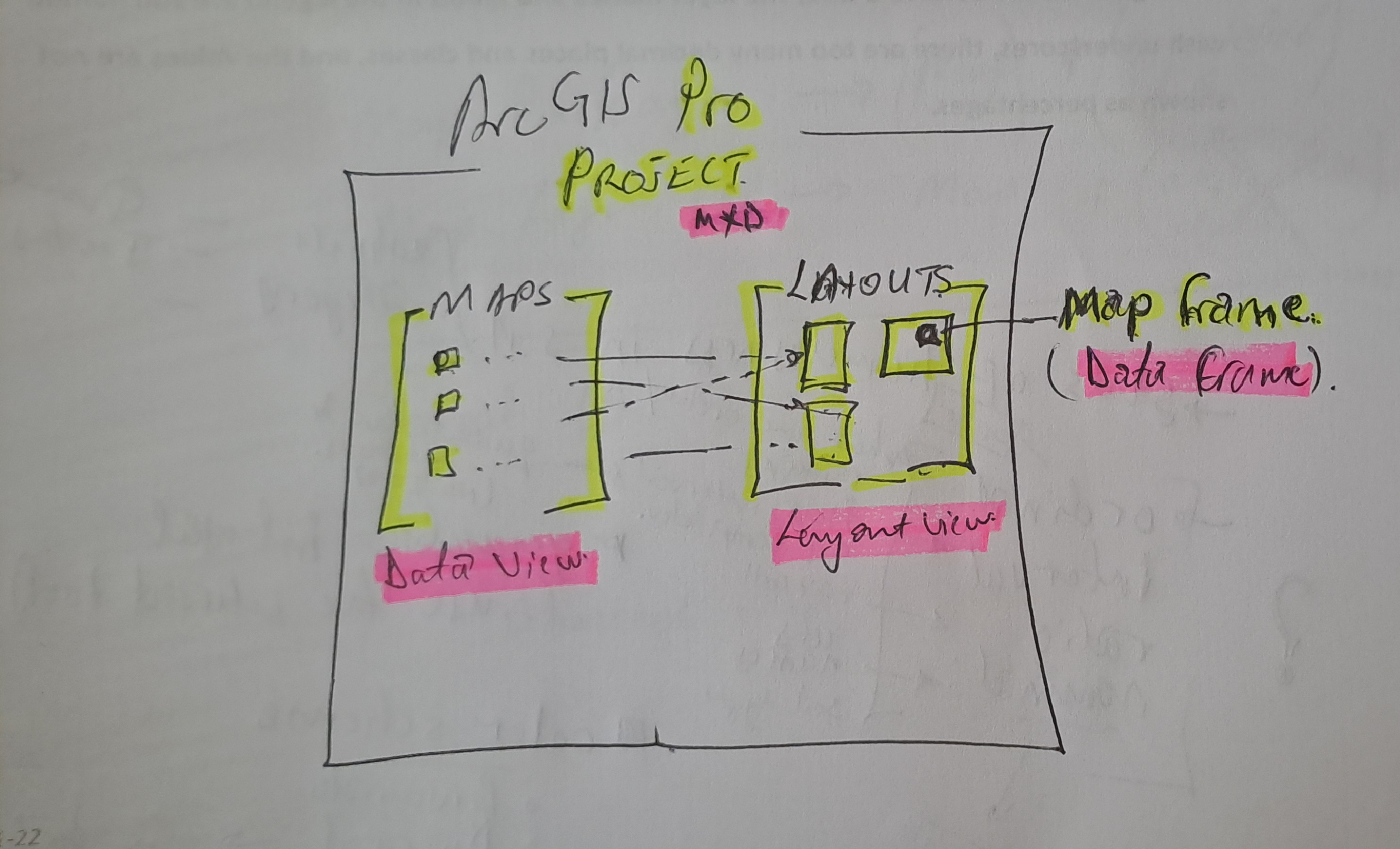
#Postscript
Huge takeaway, with a solid understanding of GIS concepts, it’s not hard to learn a spatial information manipulation and analysis software . With Pro, the Ribbon concept and context activated tools improve productivity once one knows where is what without having to ‘Search’ - which in it’s right is a must use.
28 Feb 2025

The image above was highlight of an email I received mid-February this year,a few days after I had demonstrated my spatial data visualisation abilities to an interested party. One of my favourite posts which relied on CartoDB came to mind. I got the motivation to preserve this portion of my portfolio of work.
Early Cloud
This made me reminisce all the free, limited use cloud services that scratched a tinkeror’s itch.How at one time I used RedHat’s OpenShift to host GeoServer and ran a PostGIS server on Digital Ocean, just to test the PostgreSQL database connection abilities of QGIS. It is magic to see a table turn to vectors for someone whose background in spatial science is a GIS software environment.


Migrating Maps
The email from CartoDB gave the next steps to the email heading
Your CARTO legacy account will be retired on March 31st, 2025
A new CARTO platform had been launched nearly 4 years earlier (2021).
I determined I was indeed still using the legacy platform. I signed up to the new platform.
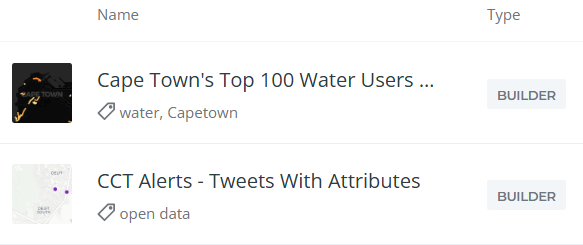
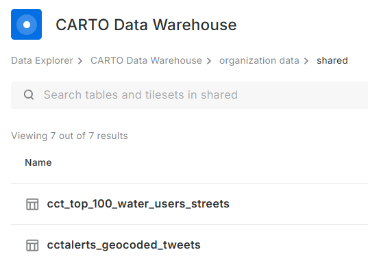
Some of my Carto maps.
There were also some Kepler.gl associated maps. These I didn’t care to preserve. Additionally there were datasets, linked to the maps, which needed to be preserved.
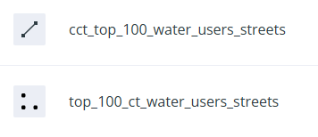
Some datasets.
Data Wherehouse
The ‘new’ CARTO platform had some catchy requirements for a tinkeror but, luckily… I could make use of their own Carto Data Warehouse. However, data needed to be migrated and maps to be recreated.
I created an account on the New CARTO platform. Indeed it carries the shiny feel of 2025 web technologies.
- Downloaded datasets from the Legacy account, chose the CSV file format.
- Uploaded the data (7) into the data warehouse connection - Carto Data Warehouse (carto_dw).
- Default import settings on data types are fine but not when time is converted to text.
- I fiddled with TIME, TIMESTAMP and DATE till I had the GPS Logs data correctly formatted.
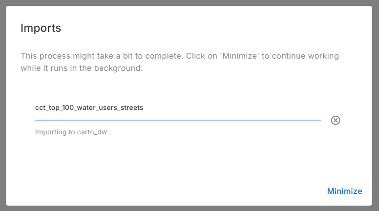
Imported data:
No Yes Visualisation Here
Before spending more effort in coming up with a visualisation, I reviewed Carto’s plans. There is none free there - except trial. So I reluctantly stopped there. Whatever I was going to create here, was going to last for 14 days. Well, I received an onboarding email from Carto while I was still busy with this blog post. I explained that I was not going to complete the migration because there was no (free) plan to meet my use case of the platform. To my delight, Carto responded a few hours later informing my plan had been migrated to CARTO Cloud Native. So finally, my visualisations can be preserved.
.No More Free Lunch!
Carto.com is a breath of fresh air. The tools in there are easy to use and quite intuitive. I tinkered a bit and came up with the below: (Click the Play button.)
Or Interact with the ‘bigger’ map here.
The final animation is no different from the one in the previous version of Carto. except that I couldn’t yet figure out how to let the point ‘persist’ for a bit longer after display.
#Postscript
Thanks to Carto’s generosity I could preserve an element in my Portfolio of work. I have four other maps to recreate, so I’ll save more time to delve into Carto.
19 Jul 2022
Writer’s Block
So COVID-19 happened and about two years of my blogging streak got swallowed in the global pandemic ‘time blackhole’. The urge to write always lingered though. Google Analytics has been constantly spurring me on with it’s monthly reports of visitors to my site. 59 unique visitors in one month, without active promotion of the site is pretty encoraging. The post of 2018 on Relate and Joins being the most popular. This taught me the apparent lesson that well titled posts generate more hits. I am a ‘spur of the moment’ poet, so a play with words is an ever present temptation. I have however had DMs requesting further information directly from my other posts. The formal work front has been busy and the aggressive fun tinkering side…not so much. The software on my PC and my github repo attest to this ‘writers block’ but, Google Analytics and DMs have drawn me out.
I haven’t been entirely idle though. Having taken some students through fundamental GIS concepts. If it counts for something, I made this globe to pimp my work from home workbench. A labourious but rewarding weekend project.
During

After
Writer’s Back
I am excited to lift out some posts from the drafts folder to published; research on and write about two spatial data wrangling problems I ran into. To keep even busier, have enrolled a mentorship program on setting up and running a geoportal this August. This will be to keep myself busy and sort of relearn some tools I have used before.
#Postscript
The way my blog is set up is a bit of a tangle. I write on my laptop (SubimeText) and publish to GitHub. There are leaner tools to blog with but satisfaction of ‘seeing’ coloured text and git in action tickles the tinkeror in me. “Commit to master”
20 Aug 2019
[A Data Science Doodle]
Map Like A Pro
So at this stage the data is somewhat spatially ready and to scratch the itch of how the Service Requests look like on the ground I went for Kepler.gl
Kepler.gl is a powerful open source geospatial analysis tool for large-scale data sets.
Any of QGIS, Tableau, CARTO, etc would be up for the task but, I chose Kepler.gl because of one major capability - dealing with many many points and that it is an open source ‘App’. (At the time of this writing, it is under active development with many capabilities being added each time.)
Since this exercise was not prompted by an existing ‘business question’, though the data is real, the questions to answer have to be hypothetical. The data at this stage has been cleaned and trimmed ready to use with Kepler. The ready to use CSV of the data can be gotten from here.
Note that this is not the entire data set of the 2011 service requests but it’s a pretty good sample. The CSV is the portion which had atleast a suburb name attached to it. viz was ‘geocodedable’.
Spatial EDA (Exploratory Data Analysis)
By turning the right knobs in Kepler.gl, one is offered the tools to do some quick EDA on the data. Some of the questions that can be quickly answered are
- Which is the most demanding suburbs?
- What was the busiest month of the year?
among many others. Let’s answer these in turn
1. A Demanding Suburb
The obvious way of looking at demand would be to inspect the dots but, that can be overwhelming when looking at 800 000+ points. A better approach is to add a Hexbin Layer based on the service requests points, Add a height dimension for visual effect and size the hexagon appropriately (to satisfaction), then enable the 3D Map in Kepler.gl
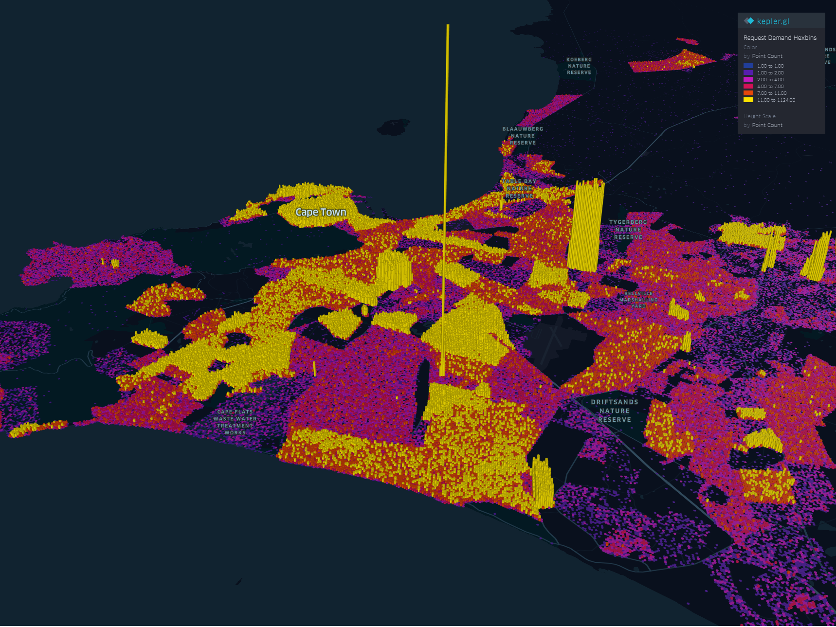
The areas with high service demand become apparent.- Samora Machel, Parow, Kraaifontein Area.
To explore the interactive visual follow this link.
2. The Busy Months
Human have this special ability to identify spatial patterns, couple that with time and we can identify patterns over time. By applying a time filter in Kepler.gl we can scroll through time and truly and get a glimpse of where and when requests activity is highest.
Follow this link to get to the visualisation. Zoom to FISANTEKRAAL - Top-Right quarter of the Map. I have set the ‘windows’ of time to one month and the speed of motion by 10.
You can zoom out to explore other areas, for instance
These questions can be answered with some SQL - but where is the eye candy in that?
These are just the few of the many questions one can answer in Kepler.
Punching Holes Into A Hypothesis
Getting the boundaries wrong ~ The power of map visualisations give one that extra dimensional look at the data. During the data cleaning and processing stage, 1. The Data - Service Requests, one primary aim was to have suburb names conform to a narrow set of names separately sourced. The knowledge of local geography revealed immediately that the definition of suburb ‘Athlone’ was skewed.
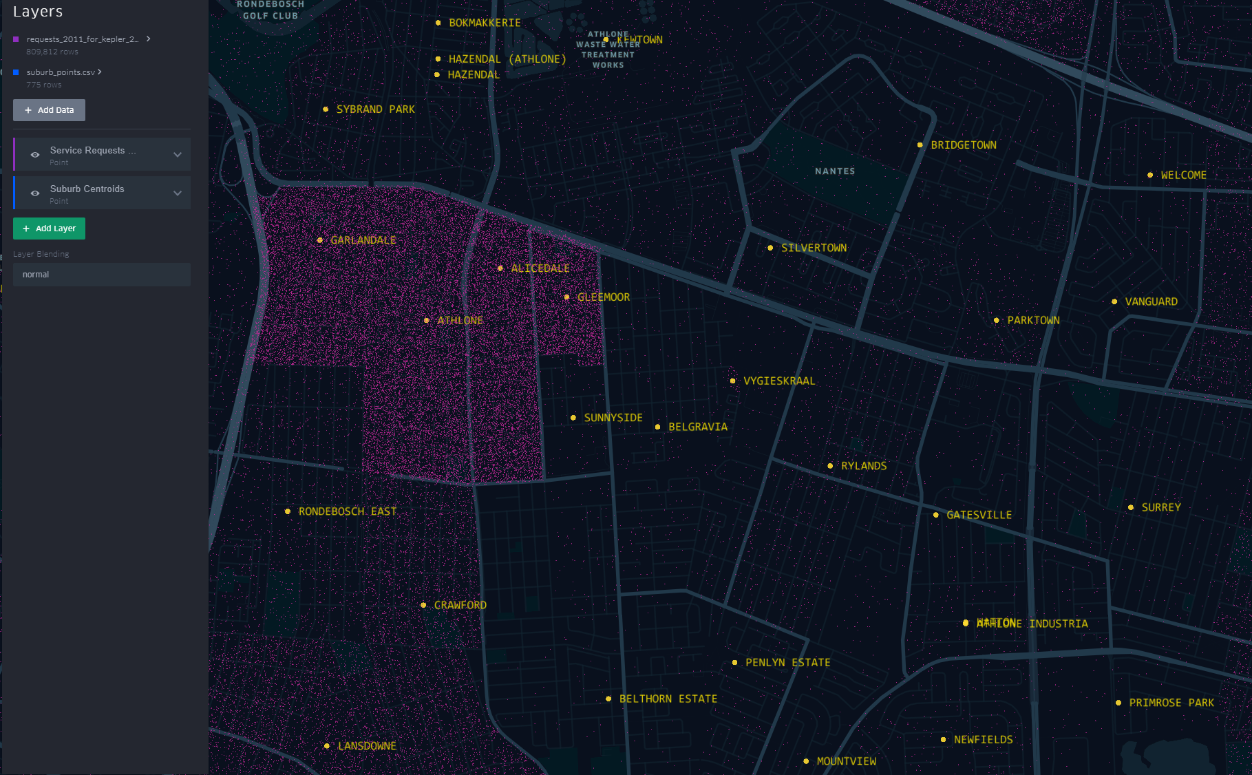
The short-stem ‘T’ cluster of points, to the right in the image, is Athlone as assigned in the dataset. By the looks of it though and local knowledge, the suburbs, yellow labels in the image all belong to Athlone (except the bottom-left quadrant). This then would require a revisit of the methodology when the ‘random’ points where generated.
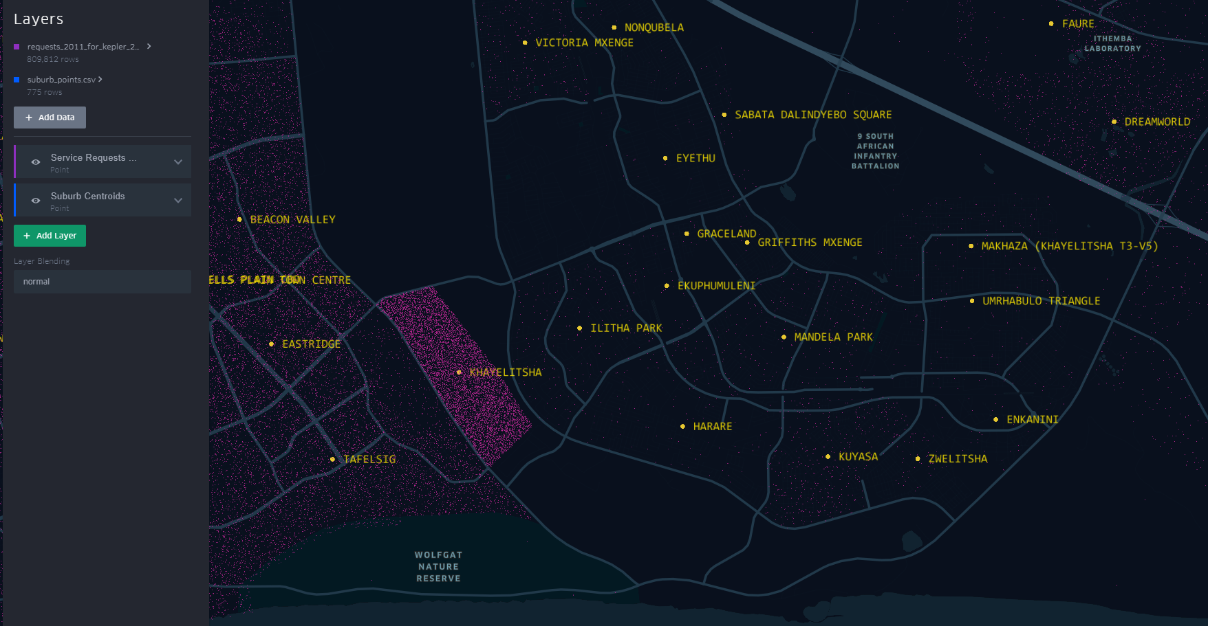
A similar pattern is revealed for Khayelitsha. All the places of the ‘hanging-sack’, represent Khayelitsha and not just the slanted rectangular cluster of points.
You can have a look at this scenario by opening the link here. Zoom to an area by scrolling the mouse wheel or ‘Double-Click’ for a better perspective.
This scenario becomes apparent when one turns on “Layer Blending” to additive in Kepler.gl
This is just a brief of how one can quickly explore data in a spatial context
#Postscript
I haven’t tried to visualise the data in any of the other ‘mapping’ softwares to see/ evaluate the best for this exercise.

